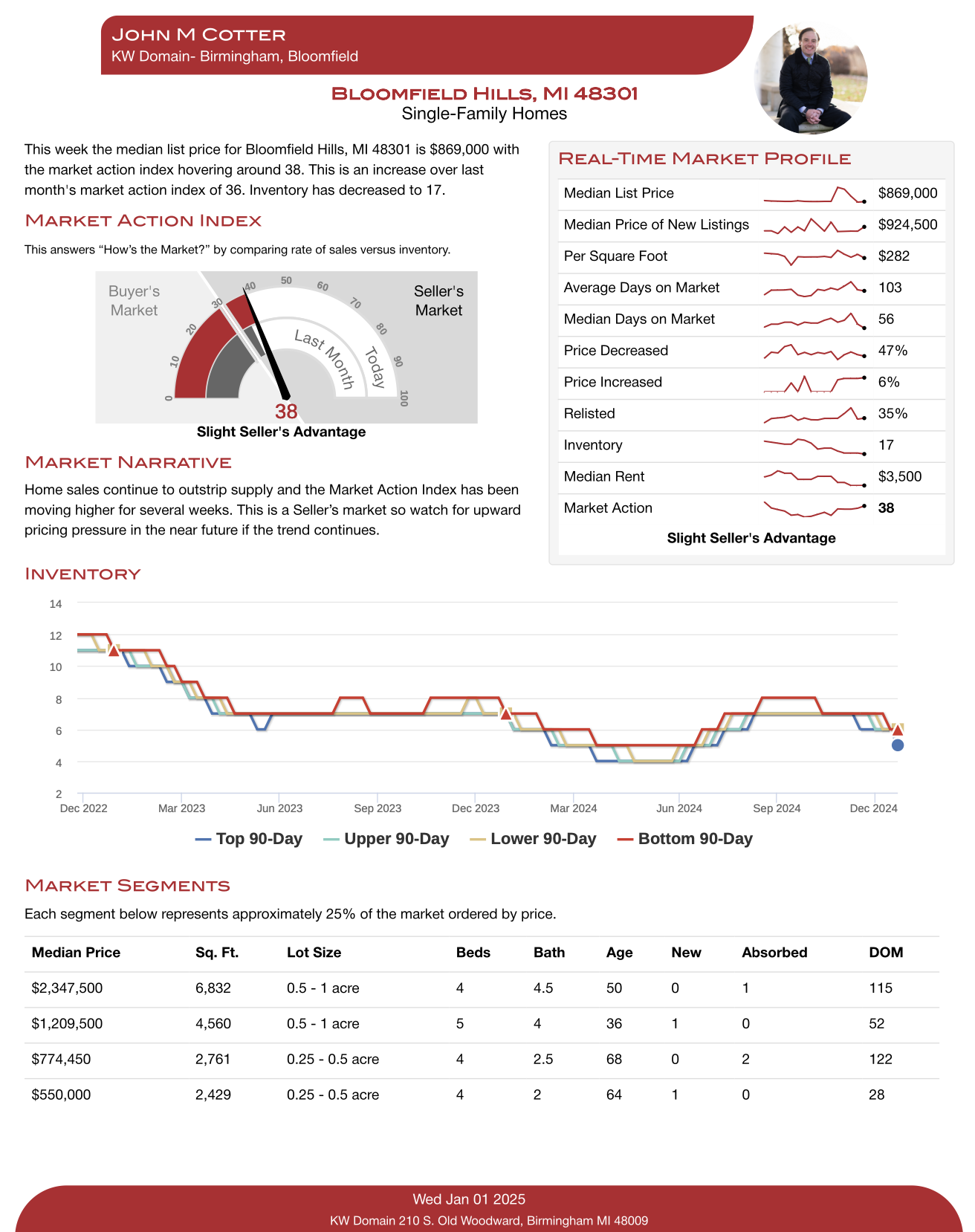
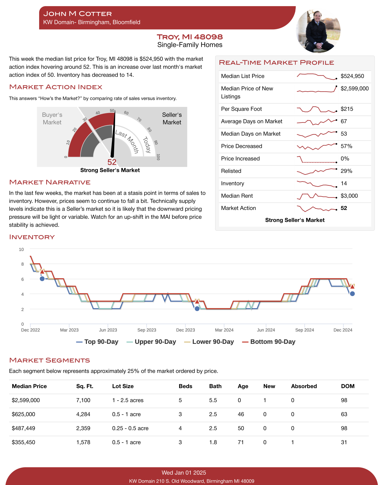
For some context- Inventory refers to the number of homes for sale at any given time. As an example, Oakland County has just under 1544 homes for sale right now. Each data point refers to a 90-day/7-day average. Across the 5-year graph, you can see, consistently, inventory has started to go down around November and December(an indication of people taking their homes off-market for the season). It’s at this point that the number of price decreases slowly decelerates until April when it plateaus. This plateau coincides with an increase in housing inventory. You would also want to analyze your particular market segment’s market action index, median price, and median days on market.
Under Market Segments, “age” refers to the median age of homes in that particular market segment. The correlation between “New” and “absorbed” is that, in the top tier, for example- there are 10 new homes(supply), with 42 sold or “absorbed”(demand) over 7 days. On a macro level, you can see that demand is still outpacing supply by some measure. DOM refers to days-on-market.


